NeatoShop Quality: Side-by-Side Comparison

Side by side comparison of red artwork of NeatoShop and competitor shirt prints

Did you know that many of our competitors actually don't print their own T-shirts? Instead, they job that out to third party contract printers thousands of miles away.

We think that printing our own T-shirts, hoodies, and sweatshirts is a key part of keeping our quality high. We've put years of effort into developing our proprietary printing technique, and the results are plain to see: NeatoShop prints are pin-sharp and our colors are vibrant (even on hard-to-print garments like fleece).

See also Photos of Our Hoodies and Sweatshirts

We won't name names, but you've seen our competitors around the Web - and if you've ever bought T-shirts from them, you'll know what we mean by the difference in quality.

Here are some side-by-side comparison photos of NeatoShop shirts and our competitors':
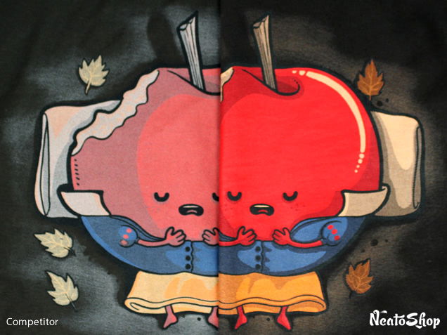
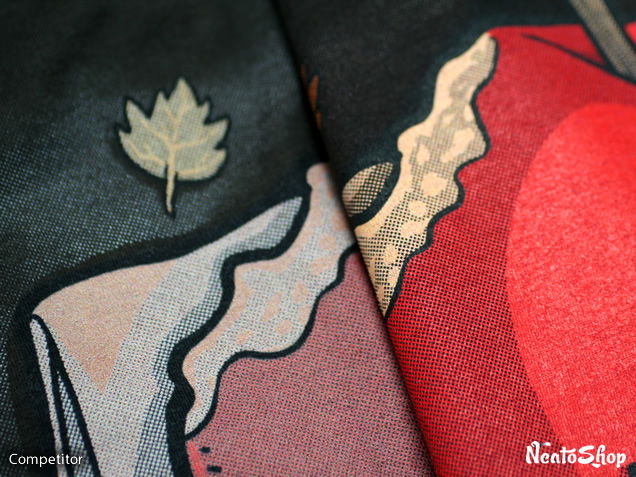
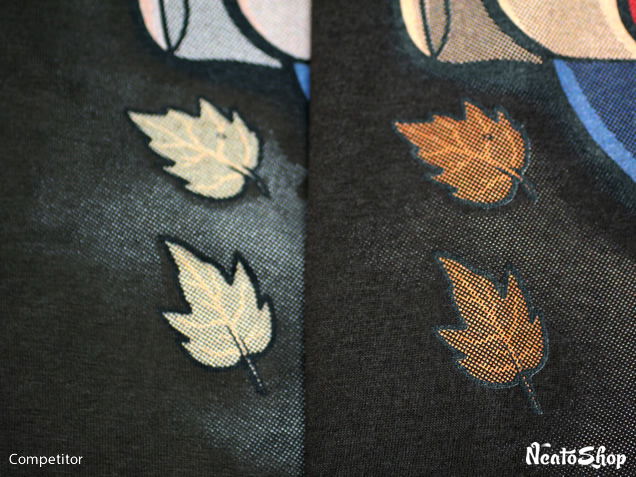
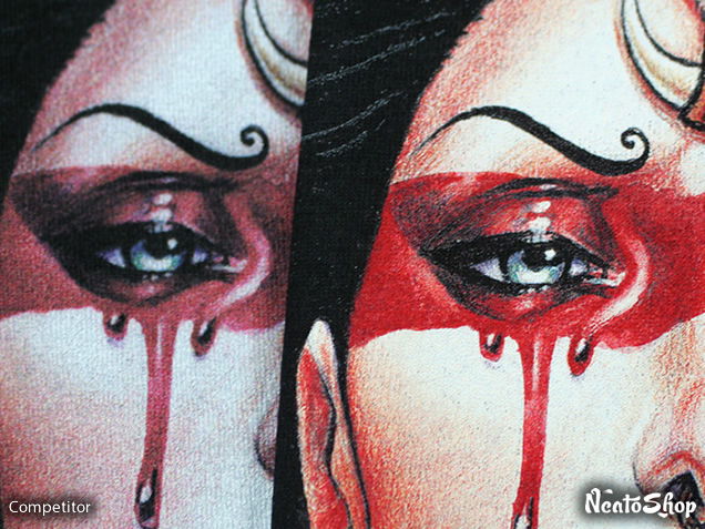
Vibrant Colors

Comparison of Neatoshop and competitor shirts
Poisoned Apple by Naolito

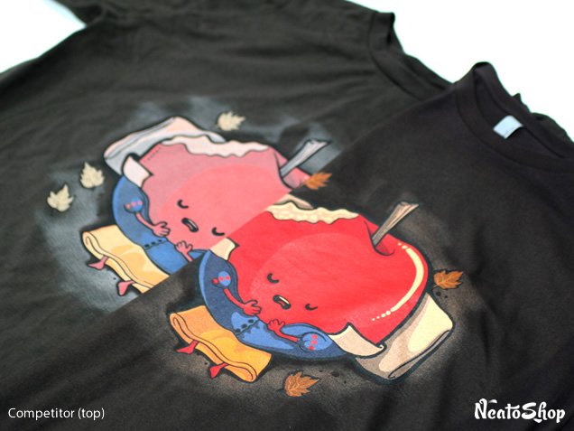
The difference in color vibrancy is like night and day: NeatoShop's shirt has vibrant colors that last through dozens of washes, whereas our competitor's colors look washed out even on a brand new shirt!

Close up of shirt comparison

Close up comparison of dotted shadow of artwork

Comparison of leaf image printed on shirts

Side by side comparison of Red Queen shirts
Red Queen by Medusa Dollmaker

Close up of the red queen face

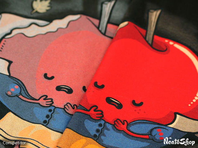
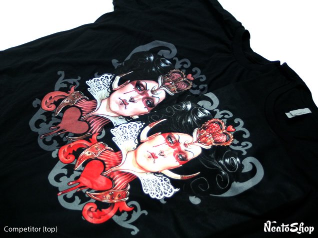
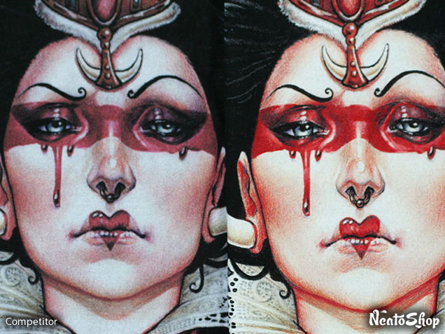
The Red Queen doesn't look so red on our competitor's shirt! We're able to faithfully reproduce the Medusa Dollmaker's vivid red crown, heart, and face paint as well as the character's flesh tone on shirts and fleece.

Close up of the red queen eyes

Close up of the crown

Close up of the red queen hair

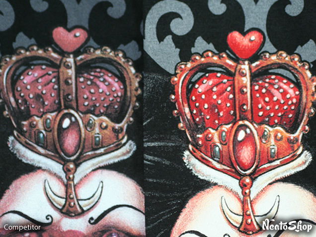
NeatoShop's proprietary printing technique means you'll see every pixel and color gradients like the waves and shine of the Queen's hair.
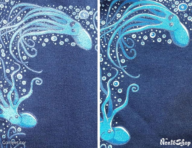
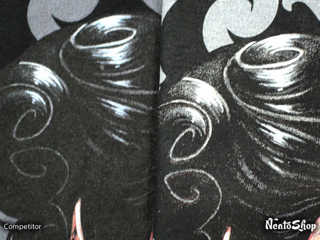
Side by side comparison of Okami Chan artwork
Okami Chan by Emilie Boisvert

You'd be forgiven if you thought the moon was brown in our competitor's shirt. It's supposed to be red, as artist Emilie Boisvert told us.

The difference in color vibrancy across the entire spectrum of red, blue, and yellow is readily apparent in this comparison photos of Emilie's Okami Chan design.

Side by side of the wolf

Close up of the red cape

Close up of the wing details

Close up of the wolf face

Close up of the moon

Super Sharp Prints

Side by side comparison of Frozen in time artwork
Frozen in Time by Gil

Close up of the glass jar

Close up of the figure nose

What happened to her nose? That won't happen on our shirts: You'll see every every line of the design printed faithfully, just like Carlos Gil intended in his fantastic Frozen in Time design.

Side by side comparison of the Back to the Firehouse artwork
Back to the Firehouse by Ninjaink

Close up of the halftone details

NeatoShop's print captures the extremely tiny halftone patterns that Ninjaink uses in this Back to the Firehouse design. You'll see every colorful pixel faithfully printed on the shirt!

Close up of the face

Close up of two of the characters

NeatoShop's vibrant colors and sharp lines sure helps make Taylor Rose's Octopi design look great!

Side by side of the octopus and bubbles